I'll think about what you said, hopefully I will be able to fix at least some of these problems. And you could try playing game, everything looks much better when it's moving. Especially interfaces, they are animated.
I think it would be cool to have colored ships in front of the background. I am assuming that some of these graphics are placeholders for designing a better interface later? That was my impression. I mean the menu's are a good start, but if it is getting in later stages of the game I would rebuff all of the UI and HUD to be easier on the eyes and look more appealing.
I think the brown color could be great for a particular storyline and it could be improved later based on what you would like it to become.
Colored ships will probably not happen. I'd like to stick with minimalistic silhouette art, because actually I am not talented in art. I don't want to mess with art styles that I couldn't handle. Also, ship building, core game feature, would probably suffer, if I added color to ships. It just wouldn't work, because now ship part silhouettes merge in one spaceship.
But interfaces will be improved. I just don't know what to do with them yet. I really like armour/ether orb frames, but at the same time I know that they look exactly like enemies.So there will be many tough decisions to make in future!


I like. I am assuming you are using GM to make this?
Yes, GameMaker: Studio
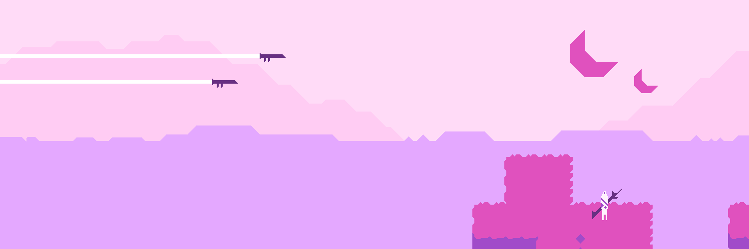
Nothing is impossible for me when I have GameMaker :)I like the clouds
Thanks a lot for feedback!
I'll think about what you said, hopefully I will be able to fix at least some of these problems. And you could try playing game, everything looks much better when it's moving. Especially interfaces, they are animated.I think it would be cool to have colored ships in front of the background. I am assuming that some of these graphics are placeholders for designing a better interface later? That was my impression. I mean the menu's are a good start, but if it is getting in later stages of the game I would rebuff all of the UI and HUD to be easier on the eyes and look more appealing.
I think the brown color could be great for a particular storyline and it could be improved later based on what you would like it to become.Colored ships will probably not happen. I'd like to stick with minimalistic silhouette art, because actually I am not talented in art. I don't want to mess with art styles that I couldn't handle. Also, ship building, core game feature, would probably suffer, if I added color to ships. It just wouldn't work, because now ship part silhouettes merge in one spaceship.
But interfaces will be improved. I just don't know what to do with them yet. I really like armour/ether orb frames, but at the same time I know that they look exactly like enemies.So there will be many tough decisions to make in future!