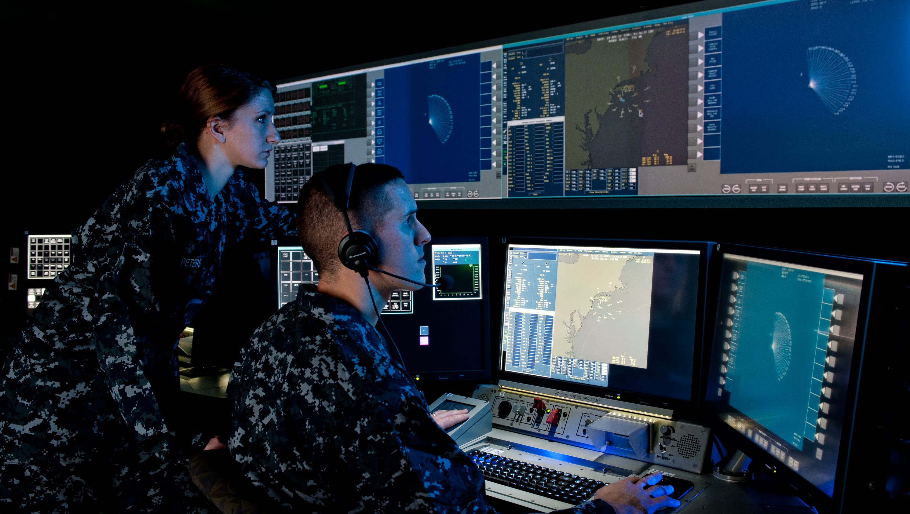
It's still in very early stages, but here's a closer look at my current project, officially named Pk: Probability of Kill.


 *not an actual screenshotIt will play a little bit like a tactics game (FF Tactics, Fire Emblem, etc) except it will be in real-time instead of turn-based.It will have a system similar to FFXII's gambit system where you can set up certain doctrine statements to auto-initiate actions, so that you don't have to issue every order by hand.Ammo conservation, radar optimization, positional coverage and timing will all be key factors for survival.
…so that's what those symbols mean
what's that ASCOPE vid showing?The A-Scope will be used for kill evaluations.
Basically, your target is the pulse on the right. The pulse coming in from the left is the inbound missile. If the target pulse goes away after warhead detonation, it's a kill. Otherwise, try again.I'm not entirely sure what you're getting at, SOB.
This is actual NTDS (Naval Tactical Display System) symbology. The icons don't rotate to imply directionality, that's what the speed leaders (the white lines) are for. If it's an upside-down semi-circle, it's a friendly sub. If it's a right-side up semi-circle, it's a friendly aircraft.There's a handful more symbols than the small subset I listed, some of which I might use but most I probably won't:@StevenOBrien - If you're asking why I'm not using sub and plane icons, it's because I'm going for an aesthetic based on my own actual experience operating a console in a ship's CIC. If you're asking why real naval consoles don't use little plane and sub icons, my guess would be that it has something to do with speed of recognition. Plane and sub icons might look too similar, and that similarity might become problematic when those icons are rotated and you've got mere seconds to react.
Whatever the case though, I'm sure they did their homework when deciding the symbols. This in-depth analysis of reaction times for NTDS symbology and 2525B symbology might be of interest: http://cradpdf.drdc-rddc.gc.ca/PDFS/unc68/p528987.pdfAlso, as the name suggests (and as colseed pointed out), speed leaders do more than just indicate directonality. They also indicate speed. The longer the line, the faster the object is moving. So you'd want the speed leaders anyway even if you rotated the icons to indicate direction.@colseed: Thanks for that link, looks like an interesting read.I understand your concern, but at the same time I think the basic NTDS icons are fairly intuitive.
A trained radar operator I might be, but even when I was first introduced to these icons in school they were immediately understandable. All it took was a quick look at a table like the one I posted here, and it made logical sense. Top-halfs are above the water, bottom-halfs are under the water, and full symbols are on the water. Yes, or land… shaddup. :PIn any case, the NTDS symbology isn't the peak of this game's learning curve. It's not going to be a super complex game, but I mean… did you see the A-scope? Players are going to need to be told what the heck that represents. lolAs long as there's proper introduction to the symbols and their meanings, I don't see any problems with this. In fact I find it quite clean and simple.
The only problem I can see as for now is the plainness of everything, as people are so focused on how things look nowadays. But that's easily fixed later on once the thing plays as it should. Got any sketches of the UI/whatever visual improvements?Looks interesting.