
So, I listened to the comments made on the previous drafts, and I've fixed these:
- The header isn't subtle (referring to the tabs) - posted by - The page should stretch the whole height, it looks ugly when there's little content - posted by - Hue of header/site doesn't match logo - I noticed myself- Logo too blurry - posted by many people, redone by a friend of mine- Padding too small.. increased to 4px - posted by many peopleAnd there we have our changes. Also, I've removed the small XHTML/CSS etc buttons at the bottom, since I think text looks better when the design doesn't have footerbg.png… so yeah. I've made some good changes, and also the logo has a nice drop shadow too. Enjoy, and if you have any extra comments/problems etc don't hold back from posting! Anyways, you're prolly asking for the link right now so here it is, in all its glory. But wait! There's a comparison there! And that explains the second part of the blog title.Because of the request to have the page stretch the entire height, I had to change the header image so that it was no longer transparent, but instead had a layer under it that had the background colour of the page. Unfortunately, IE7 didn't want to render the hue of the image properly, and there is the reason why IE sucks. And there's heaps of other reasons that everyone who uses a decent browser should know.Blawg end!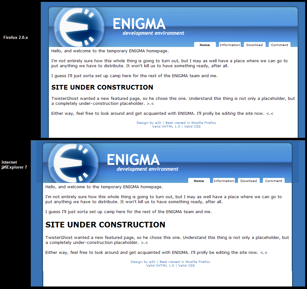

Edmunn has a nice background color
Thank you, but Josh @ Dreamland doesn't really like it.
I like edmunns better
As do I.