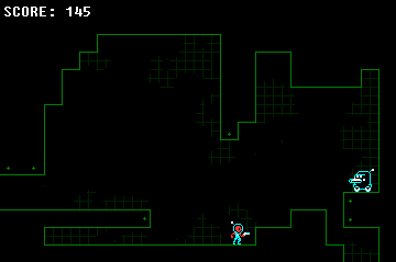
No, instead, I have something nearly as bad: A stickman.
Well, a temporary stickman until I come up with a better idea. I'm focusing on gameplay first, appearance later. And that almost sums up what I'm working on…The other two honorable mentions are a Megaman fangame I'm working on (For my youngest brother) as well as an unnamed and barely thought of concept. I'll post a sprite from both:First, my new character, a dragon of sorts. Just note that this is an unfinished sprite, I'm just using it as a reference:
 And this is the main character for the Megaman fangame, based off the Zero sprite from Megaman X3:
 I told my brother that if I "have" to make him a fangame, I'm at least going to modify the sprites and make some semblance of a storyline. I'll see how far this gets. In other news, I just found out that the book I WAS working on (The Game Maker 8 Cookbook) has been started again. The publisher is looking for an author. I'm kinda wishing I could get back into it. I've put In a Word on the back burner (Since nobody likes games with squares for characters) and am focusing on my new projects, in addition to Eternal Castle. Anyways, back to work.
gradients i don't suggest. if it's an old style than you have to limit the amount of colors and they didn't have shading back than xD
but of course, it's your game, you can do what ever you want lol. i don't see any problem with the dots, in fact it kind of enters your sub-conscious and i can tell, it might aid game-play unnoticeably, working as a visual measurement between to platforms.
-You can be simple without being cheap. -You don't need many colors to make your sprites feel solid.-Don't forget to give your sprites character. It looks better in 2x: http://64digits.com/users/Mush/mock452.pngMush = my hero.
that doesn't look Atari at all Mush. looks like an Atari 2600 mated with an NES and this is it's offspring.
I don't know where you've the idea that this has to look like an Atari game.
I was responding deathzero021's comment. You haven't actually mentioned anywhere about giving it a retro feel but switching between two graphical styles is an interesting objective, gotta keep the art style consistent though. Also, why would we argue with you? It's just some fucking dots, dude, we're not that petty.
We're making suggestions, not picking a fight. Having outside input is incredibly valuable, and I don't see why some people are so afraid of it.
I'm not afraid of outside input. I tried the gradient effect, but it looked worse. Also, the dots help to differentiate between solid ground and empty space.
Who the hell suggest a gradient? Moikle? That boy should be shot. Gradients never look good; never and nowhere. Go with something close to Mush's concept (minus the NES-style characters if you don't like them).