
Hey guys,
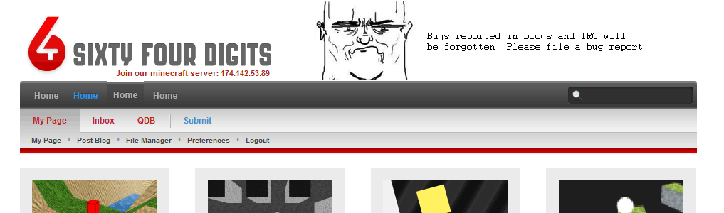
I've decided to keep the dark grey, because i think it adds some much needed contrast to the site. Plus, it will mesh well with miscontruct's (http://64digits.com/users/Misconstruct/user_sidebar.png) mock up of the "badge."Here is the new menu mockup:http://64digits.com/users/Canadonian/menu_3.pngI just did a 10hr day at work today and I've gotta get up at 6am tomorrow, so I'll be coding it later (if anyone really opposes the new 'condensed' version, shout at me through PM's).Current TO DO:- Refine top menu (with condensed menu and drop downs)- Redesign left '64d Badge' using misconstruct's mock- Refine css- Sleep moreCheers all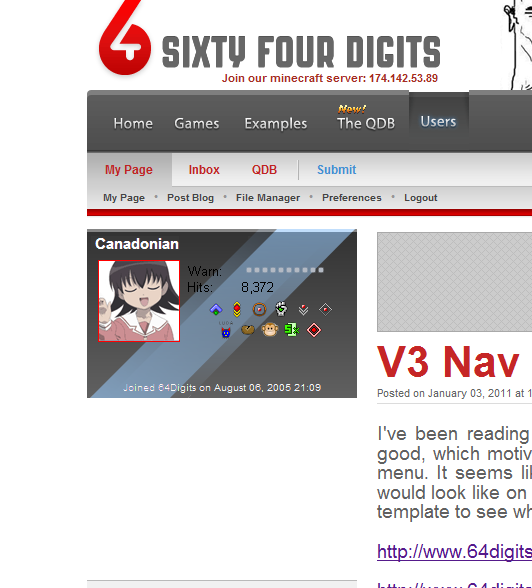

I like it, but miss the shininess :(
Looks good, you've been working very hard, there's no rush on these changes.
Yes, do that but with the shininess of the current banner. :D
The shiny serves no purpose.
Glad you liked my mockup. :D
I think there should be some shiny, but a little less noticable.
Also, put badges by hits? doesnt need own section…. idk maybeand i would still suggest the light #EEE border for the left…. but i think t just needs to be a tad smaller in widthThe magnifying glass looks worse (AKA less visible) on the dark background.
Drop downs? D:
Top menu is improved (yay no more redundant QDP link!) but you've still got more than half the vertical space taken up by some completely pointless image.
The dark grey is nice, but I don't like the shine on the user panel on the left.And do something about the blue bottom menus. Long ago you once told me to not incorporate any blue into the design because it had no place in 64digits. >=(Also, by drop-down I'm assuming you mean the smallest bar of headers only appears when hovering over the next level up?