Web designing is one of those things that you sit at and work on until you feel board or cant be bothered to do any more, when your off the pc, you think to your self… Ill go and do some more coding, its the excitment of turning on the pc and starting to code until you get board or tyered again. I think im really good at web designing myself, ive done the odd bits on websites for friends, maybe ill go pro one day. If anyone has a site and are hiring or need help with there site, im up for it.
7 things I hate on websites:Don’t you just hate it when you come to a website and there’s no clue what the website is about, when you are just wasting time looking at a page full of ads and fighting pop-ups or you can’t find any navigation with a link to contact, login or registration?There are so many ways webmasters use to annoy their visitors and I decided to list here a few of those that really drive me nuts. The reason I am writing about this is not to complain but more to help others to avoid creating those annoyances and to help keep your website visitors happy.No title and invisible headlines - Okay, so I come to a website and it doesn’t give me a clue about what I am looking at so I leave the site. This process takes only about 2 - 5 seconds. People are scanning websites not reading. People read the content only when they find exactly what they were looking for so having visible title and headlines makes it a lot easier and faster to grab one’s attention. You have only a few seconds to convince people to stay on your website so don’t waste the opportunity.Invisible navigation - once you have one’s attention it’s a good idea to make it as easy as possible for everyone to find their way around your website. Making them work hard to find stuff on your site will result in frustration and loosing them forever. Here’s one example of poor site navigation. Just try to register or login to the site. I bet it will take you more than 10 seconds if not a few minutes to find what you are looking for and you’ll also be able to feel how your frustration builds up. So please make sure your navigation is visible and easy to follow.Pop-ups - okay, there are 2 types of pop-ups. Good pop-ups and bad pop-ups. The good ones are those providing additional information to the content you are currently reading like help, contact info, etc. The bad pop-ups are those containing ads popping up every time you reload a page or those that force you to make certain action like bookmark the page or set the page as your homepage.Just remember if you want to show some ads and keep the visitors coming back do it in more friendly way.Under construction - How much fun is it to come to a webpage that says “Please be patient as I continue working on this website” or “Under Construction”? Not much, right? It is a good way of wasting people’s time. So first of all, if it’s under construction don’t publish it. Second of all, all successful websites are constantly being worked on so there’s no good reason to tell everyone about it.Tiny crazy animations - we’ve all seen the crazy flashing colorful animated gifs with flying envelopes, rotating globes and shaking hands. Although web page design techniques have changed drastically since the nineties there are still many websites using it. Please, stop it already. It’s annoying and it doesn’t do any good to your image.Website overloaded with ads - pages loaded with ads, mostly done for the purpose of search arbitrage, is now a very popular way of making money online. You simply drive as much traffic as possible to a page filled with ads and thus giving visitors no other choice other than clicking on them. Usually those types of pages are poorly designed so there’s no pleasant experience coming to those pages at all.Slowly loading pages - With the growing number of broadband users this issue isn’t as hot as it was a few years ago, however don’t forget there are still many people using dial up. Different load times can be targeted based on your target audience.I know there are many more website annoyances there but writing about all of them would be a project better suited for a longer article or even a book.Feel free to add your comment about what you hate most or what you find annoying on websites.Cheers
Hold that thought, i have seen a site that has music, but without the music the site would not be very good.
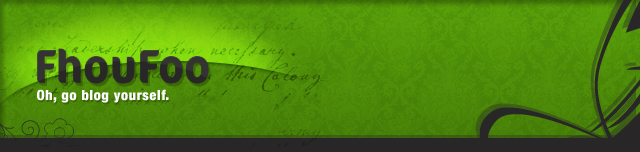
I like the banner too.
You could change your name, I think it is fine as it is though.O MAn you listed all of the problems but you put 2 things about too many ads
but its TruealrightcyaAny particular reason you just paraphrased the textbooks and documents I got in hypermedia?
I've got a couple more:
1. Clashing colors that clutter the page so badly you can't tell what you are reading.2. Inconsistancy between pages on a single website. For instance, when you click a link, and you can't tell if you are still on the same site or not.I know another one: Musical webpages annoy me so much! You're browsing the internet and everyones in bed then suddenly you forget you have your volume up high and you visit some site without realising music will come blaring out!! That actually happened to me!
If you're still having seeing these problems on websites in this day and age, you're viewing the wrong websites.
Yeah, I have to agree.
@ FireflyX, very true. I've had that happen before. Music should not play on websites.-ElmerniteI agree to everything you have just said.