Like most creative people (I assume) I'm often trying to improve. I came to the realization that, despite getting more intricate and all around better looking over the course of the past 7 years, my sprites all still bear really amateur features. My coloration is limited; I tend to avoid changing colors too much while shading. All of my shading is just lower brightness of the original color. I also still use true black outlines, which make things look flat and amateur.
So I decided to try to move forward with my spriting by changing those things; this is what I came up with.
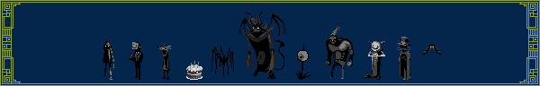
I started with a basic outline, drawn with a mouse. I predominantly use the line tool to do outlines. I don't know if that's a bad practice or not, I'm just used to it.
I chose to make a sprite of the dastardly Murdergoat.
Next I did something that I've never done before; I made an actual palette. The colors actually change hue and saturation and fade from highlights to black. I picked the third color of each palette and used them to fill.
Next I shaded. I started with the second colors on each palette, then the fourth, then the first and fifth. Usually when I sprite, I tend to avoid having two colors touching when there's a shade between them. With this sprite I just did whatever I thought looked good.
Something I was a bit apprehensive about was changing the outline. I chose colors from the palette that were darker than their neighbors. I only used the third, fourth and fifth colors from each palette. I replaced the outlines where highlights were nearing the it. I imagine it'll be tougher to animate this with the outlines standing out less, but I can always revert to black outlines and then reshade them when I'm finished animating.
Finally I darkened the area around the eye and gave it a fiery glow. I thought it would look cooler.
So yeah, this is the first image I've ever made that I would actually consider pixel art. I'm quite proud of it. I know there's some really talented pixel artists on this site, so I was wondering what you guys think.


I'm no pixel artist, but it looks great for a first attempt. Fuck.
@Steven
I think what you're seeing is because left upper arm is obscured by his torso. I don't know what else it could be, I don't see it.@Unaligned :D Thanks, man. I've gotten decently good at spriting since I've done it so much, the problem is I wasn't adhering to the very basics of pixel art.No, actually the arms look just right, the one on the left should be a bit smaller because of perspective. looks sick to me
If DSG likes it I must be doing something right.
Thanks for the input. Not used to working with perspective, but I'll give it a try next time.Lookin good. Although I'd recommend against being so generous with the shading in small spaces (like the legs and shoulders) next time. It can sometimes make things look puffy and pillow shade-y. And what DSG said, things in the background are generally smaller.
That's a good design. Very nice outline, and very nice overall.
@Rez Thanks. It's hard to give something shape through shading and be conservative about it, for me anyways. I'm sure it's something that'll improve with practice. I know what you're talking about, though.
@Spectre What's wrong with the shading? It looks intense, like he's walking out of the shadowy depths. Let me know what you mean, and I'll see what I can do.@Mordi Thank you, I was considering using this sprite later on for a fighting game that pits incredibly random characters against each other.
just for lulz. not to illustrate any points. here's how I would've shaded itthats killer
@Rez. That is beautiful. TEACH ME THE WAYS.
@Spectre Ears… tail…. How did I forget those? I guess I was too busy doing the techniques correctly to focus on the form. I don't really like when the colors are THAT varied, looks a bit busy/abstract. It's a respectable style, but it's just not my style. Thank you for your tips, though, I did learn quite a bit from them.